 Digital Commons Help Center
How Can We Help?
Design Customization Guide for Sites, Journals, and EventsDesign Customization Guide for Sites, Journals, and Events
This guide is for Digital Commons repositories starting the design process as part of their site setup, and for journals or events that would like a unique design. It explains the available options, how template-based designs work in Digital Commons, and the steps in the design process–from completing the setup form to launching your new repository, journal, or event.
When you’re ready to begin a new design request, or if you have any questions not covered here, please contact Consulting Services.
The Digital Commons Design Process
The design process begins when you return a completed site, journal, or event setup form to Consulting Services, along with images and other materials you’d like incorporated into the design. The Digital Commons design team will use these assets to create a site mock-up and up to two revised mock-ups based on your feedback. Once you approve a mock-up, we will build a demonstration site based on the selected design. Your live site can be launched following completion of the demo site.
Phase 1: Gathering resources and completing the setup form
The setup form will be the foundation of your site’s design, so it’s important to make sure everyone involved in the project has a chance to provide input. Technical design details are welcome, but never required. Give us your best description, including any websites that you’d like to match, and our design team will translate your vision to the Digital Commons templates.
Along with the setup form, please include any images, logos, or other assets that you’d like to use in the design. While our team is unable to create images from scratch, they are happy to work with and modify the assets you provide.
Prefer to create your own design? If you would like to have us base the design on a mock-up you supply, Consulting Services can provide a Photoshop template.
Phase 2: Reviewing and approving design mock-ups
Our design team provides up to three mock-up iterations to perfect the design, incorporating any feedback you have until you’re ready to give approval. You may choose from any of the completed iterations for your final design.
Once a design mock-up has been approved, the design is considered finalized and further modifications may not be possible to fixed elements such as the header banner, site colors, and footer. For more detail on the mock-up process, please refer to your setup form.
There are still many other ways that a site with a finalized design can be modified: Read more about flexible elements and add-on features in the “Design Template Specifications” section and also see Displaying Logos, Images, and Slideshows on Your Site. In addition, you may request a redesign annually if one is available for your site; please check with your consultant if you would like more information.
Phase 3: Demo site setup and administrator training
We recommend using the demo site to familiarize yourself with the features of your repository, journal, or event. After the demo site has been created, Consulting Services will plan a training session to review the configurations and site tools for administrators, editors, and any other stakeholders. You will also have the opportunity to use the demo site to fine-tune body text and links before launching the live site.
Phase 4: Site launch and publishing content
When you’re ready to launch the new site, please contact Consulting Services with at least three days’ lead time to allow us to configure the site. The demo site and its configurations will be copied to the live, publicly accessible site along with body text and links. Articles or other submissions you’ve uploaded to the demo site during training or testing will not be transferred.
Design Template Specifications
All Digital Commons repositories, journals, and events make use of common templates, which can be customized with unique design elements. These templates provide a design framework, facilitate a quick setup process, and come with many configurable elements. The commonalities in our templates allow our developers to roll out new features and improvements to all Digital Commons sites regularly. However, these improvements also require that site designs adhere to some specifications. Following these specifications helps ensure your site will avoid potential issues with display and maintain functionality with future versions of the Digital Commons software.
The Digital Commons basic template
All Digital Commons sites are composed of the elements highlighted below. The basic template sections and dimensions are identical for each publication type. Content in the sidebar and main content area will differ.
Note: Sample images are not to scale. Please refer to the dimensions listed below or ask your consultant for a Photoshop template.
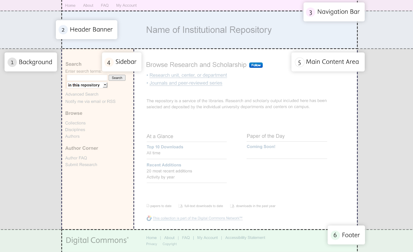
1. Site background: A simple background is ideal for a design that will not distract from your content. White or flat colors are excellent choices. Repeatable images or patterns also work well as they load quickly.
2. Header banner: Our design team can use a banner you provide or we can work with art assets that you include with your setup form to create an original banner. If there aren’t any images or other assets available, we can create a simple and professional text-based banner for your site.
- DC banners have a fixed width of 980 pixels. The background area on either side can be utilized to achieve a full-width look (on most monitors). If you’d like a full-width banner, the width of the image provided to us should be at least 1920 pixels.
- Banner height is variable, with an average height of 126 pixels. We recommend moderation with height since banners appear on all pages of the site and tall banners can push content down the page where it’s less likely to be noticed.
- If you’re creating your own banner, please keep in mind that small text in a banner can be difficult to read on mobile devices. Here are a couple of examples of banner layouts.
Note: Sample images are not to scale.


3. Navigation tabs: The standard global navigation links (Home, About, FAQ, and My Account) appear in the horizontal navigation bar. These tabs can appear above or below the site banner based on your setup form selection.
4. Sidebar: The sidebar is 240 pixels wide and extends vertically to match the length of the page. Depending on your selection on the setup form, it can appear on the left or right side of the page. By default, the sidebar contains search, browse, and author links sections. Many institutions include a logo or social media icons below these links.
5. Main content area: This section contains most of the site’s content and is very flexible, though the maximum width for content contained here is 740 pixels. The design mock-ups you receive will include placeholder text containing a list of links and a bit of introductory text, and cover art for journals if requested.
- Many sites also use this area to hold a slideshow, content carousel, or image.
- You may choose browse buttons for your repository homepage instead of browse links, if desired, and these will appear in your design mock-up. See the site setup form for button options.
- As a site grows, the main content area can be adjusted to include a readership map on the repository homepage as well as a Discipline Wheel reflecting your site’s scholarship. New sites launch without these features enabled, so they’re not included in most design mock-ups.
6. Footer: The standard footer links, including the accessibility statement, appear here. The DC logo is also in the footer and always appears under the sidebar. Many institutions decide to include a secondary logo in the footer, but we recommend not adding critical links because they won’t be visible when browsing on a mobile device. As an alternative, we support adding extra links to the sidebar.
Elements to Focus on in Your Mock-Up
Overall, we recommend focusing on images, colors, layout, and typography during the mock-up approval phase of the design process. Once you approve a design mock-up, these core elements of the design become fixed.
When preparing mock-ups, our design team looks at big, repeatable elements that appear throughout the site. These include the header banner, background colors, sidebar position, navigation tabs, and the footer. While content is also an important consideration, your unique text and links in the main content area and sidebar are typically not included in mock-ups unless requested. An image slideshow or content carousel may be included in the main content area to get a sense of the overall homepage layout. However, these and many other elements in that section remain flexible after launch.
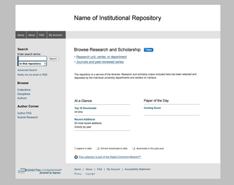
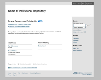
Site Layout
Please refer to the following when completing the “Site Layout” section of the setup form. The sidebar may be positioned on the left or right side. Navigation tabs can appear above or below the header. Below are two possible site layout configurations.
The site layout options only affect the positions of the navigation bar and sidebar, and don’t change the other features or options available to your site.
 |
 |
Colors, Logos, and Images in Your Design
Check with your institution’s marketing department for any specific colors, logos, typefaces, graphic elements, or other requirements. Feel free to include a style guide or graphics standards with your setup form.
Considering accessibility when choosing a color palette
All DC sites include an accessibility statement and follow both the Web Content Accessibility Guidelines (WCAG) 2.1 and U.S. Federal Government Section 508 Guidelines. When suggesting a site to match or including colors in the “Additional Design Notes” section of the setup form, please keep accessibility in mind. A color palette with adequate contrast allows more users to access your repository, including visually impaired or color blind individuals. Our design team may need to make slight adjustments to your design in order to meet accessibility standards.
Images and logos
If you would like to include images or logos in the design of your site, please provide them to Consulting Services along with your setup form. The setup form contains more details about image formats. For your header banner, you can specify images to use in your banner or provide your own header banner following the specifications detailed in the “Design Template Overview” section of this guide. You might also consider a full-width image in the main content area below the banner (see Displaying Logos, Images, and Slideshows for more details).
Image slideshows and content carousels
Image slideshows and content carousels allow you to curate and share dynamic images with visitors on your repository, journal, or event homepage. If you know you’d like to include a slideshow or carousel, please indicate this on your setup form and we will include it in the mock-up. See Displaying Logos, Images, and Slideshows for more about these display options.
Site Typography
The default typography is displayed below. We recommend Arial and Georgia CSS font stacks, but our sites can support other web-safe font stacks or Google Fonts.
See our suggested web-safe fonts below or browse Google Fonts for the closest match, and enter it on your setup form.
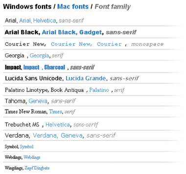
Digital Commons default typography

Suggested web-safe fonts
Additional Information about typography
Digital Commons formats written content using the CSS font-family property. This property specifies which typeface the browser should use when loading your site. In its simplest form, only a single typeface needs to be specified.
However, most typeface files are located on site visitors’ computers, so there is no certainty that the correct typeface will be used when a browser renders your repository. Since not everyone has the same browser or installed typefaces, naming only a single typeface can lead to a repository that looks different than expected.
“Font-family” provides a mechanism for dealing with this: it accepts a comma-separated list of typefaces, or font stack, and it will try each in turn until it succeeds in matching an available font.
FAQ
What domain address can we use for our Digital Commons repository?
You may choose a unique domain or make it a part of an existing one. Examples: https://ideascholar.com or https://ideascholar.library.umarin.edu. The domain cannot include a subdirectory (example: https://library.umarin.edu/ideascholar). Your repository’s domain address is permanent and any changes after initial DNS setup may incur fees, so it’s best to choose something that can continue to represent your repository.
Can we name our repository “Digital Commons?”
“Digital Commons” shouldn’t appear as a stand-alone title for a repository. Digital Commons is a trademarked name, and your repository is a unique instance of a product. If you choose to use “Digital Commons” in your official name, you’ll want to connect it with your institution. Examples: “Digital Commons @ Marin University” or “Marin University Digital Commons.”
We recommend choosing a unique name, if possible, for search engine optimization. When common words or phrases appear in a title, your site may be forced to compete with other similarly named sites for a limited number of spots at the top of search results.
Our institution is rebranding. Can we revise our repository design?
Redesigns are available annually, if needed, for existing sites. If you need to make changes to the design of your site once it has been launched, please speak with Consulting Services about redesign options. Site redesign fees may apply after a design has been approved.